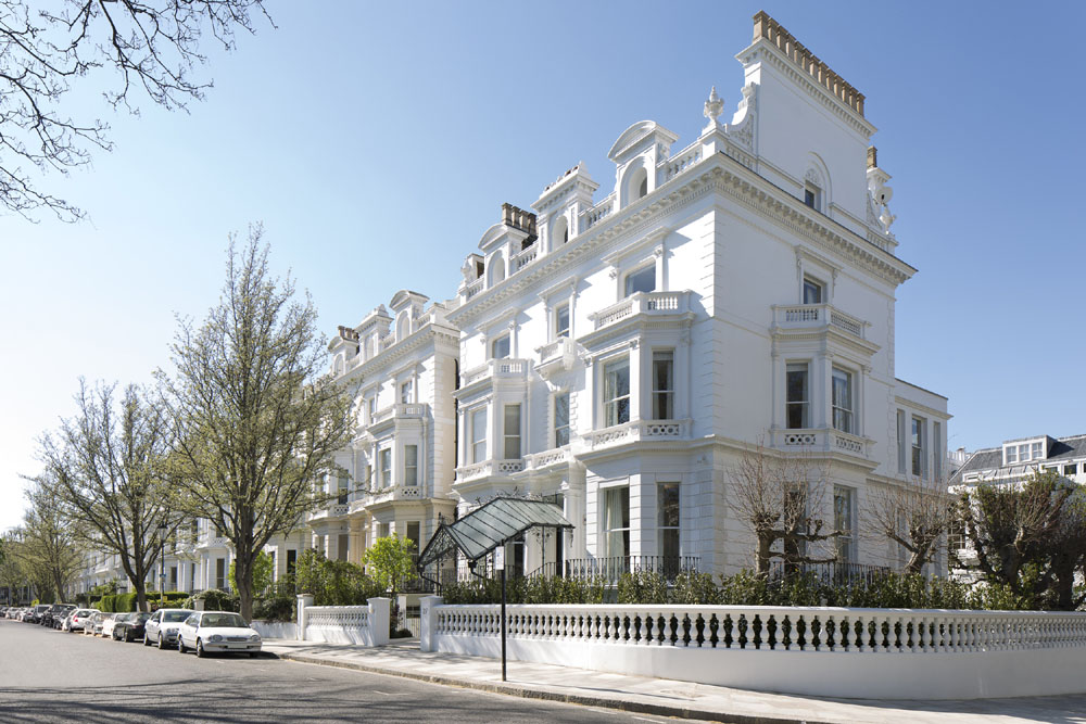
The kitchen, bathrooms and bedrooms were all over-hauled in this impressive London property
It’s not every day that a six-floor Notting Hill townhouse needs to be redesigned.
The project saw the William Garvey team collaborate with leading architects Brian Ma Siy and ABA International Architects to make-over the property from top-to-toe, with everything from the master bedroom to the staff quarters given a fresh new look.
The project in a nutshell
Who lives here? A family with live-in staff
The style: Modern and minimalist, with a family-friendly twist
Architects: Brian Ma Siy and ABA International Architects
Photography: Recent Spaces
The extent of the project was huge. The sprawling property includes no fewer than four bathrooms, four bedrooms, six guest rooms (including a variety of bedrooms and even a kitchenette), two dressing rooms, a formal dining room – and a lot more, too.
Key to the aesthetic of the space? Wood, and a lot of it. The team at William Garvey created thoughtfully designed furniture solutions for each and every room in the home; the airy playroom, for example, is kitted out with shelving built into the walls, perfect for guaranteeing little ones can’t pull anything over. Safe and stylish – we approve.
The master bedroom, meanwhile, features a wooden headboard comprising shelving that’s perfect for displaying photographs, artwork and other meaningful trinkets. Impressive and huge, it makes the bed a true focal point within the space, emanating a delicious vibe of decadence and luxury.
A built-in wardrobe offers subtle storage; the dark wood furniture of the boudoir sits in perfect contrast to the white walls, with clever lighting and huge windows serving to accentuate the airy appearance.
The wood also adds a warming effect to an otherwise neutral space, resulting in a space that strikes the balance between Scandi-minimalism and cosy-rustic perfectly. It’s a theme that extends to the other bedrooms, too.
The kitchen features a variety of pin-worthy details: we’re talking a curving Solid English Oak dining bench, fireplace cabinetry (designed to house an LED screen and speakers) and full-height cabinets, complete with adjustable shelves.
To the bathrooms! All have been designed with walnut vanities, with adjustable shelving, mirrored doors and vertical LED strip lighting and under-cabinet lighting creating soak-spaces that are as enjoyable to use as they are perfectly practical.
Naturally, we need to pause for a moment to appreciate the property’s spa zone, which features a Japanese bath and Japanese basin table, both made from cedar wood; the sauna bench is made from the finest Scandinavian timber.
Each piece of furniture was handmade, tailored to fit the unique dimensions of the property to create a truly bespoke collection of pieces – everything fits its place perfectly, including that television screen…
Throughout the home, a mix of materials results in an aesthetic that’s both traditional yet modern: dark walnut is perfectly paired with glacier-toned surfaces to create an inspiring palette of tones and textures.
Naturally, a project of this size wasn’t without the occasional hurdle – although the William Garvey team managed to address them with minimal fuss. “One challenge was the need for adjustable shelving with integral lighting,” explains the team. “This element required free movement of both the shelves and LED lights from one position to another, without effecting operation when position”. The solution? A 100% bespoke new design. “This design detail was not in existence at the time of specification and so had to be exclusively designed by Bill Garvey, who made a discreet furniture system that remains completely invisible from view,” reveals the team.
Soft accent lighting and wooden furniture make a beautiful combination in the home, with the former gently accentuating the vertical grain of the latter, ‘accentuating the beauty of both form and function’ throughout. Adds Bill Garvey: “This unique angled LED light slot design was hugely time-consuming for us, requiring great care and a high level of accuracy. Nevertheless, the end results powerfully added to the overall effect of a ‘perfectly integrated interior’, which the architect, Brian Ma Siy, was trying to achieve”.

